Overcoming technical constraints
When the developer started building this screen, he highlighted complexity in the navigation for the expiry date and security code fields, this also allowed us to rethink the UX and UI and better align with some existing screens.
Design and interaction were initially created with a single field on screen e.g. Search
Navigation is complicated - do users select the field to start typing?
Focus should be on A and we’re starting with numbers
Focus states are unclear
Is it possible to use numbers on the remote?
Special characters and accents have not been included
Solution:
After reaching out to the UX and UI designers who initially worked on the keyboard design and navigation, a workshop was organised with all designers that had used keyboards and forms. We revisited competitor analysis, looking at platforms such as Apple tv, Netflix and Prime Video.
It was important to keep developers and POs in the loop as this would impact milestones but was important to solve for MVP.
To reduce impact on milestones we focused on:
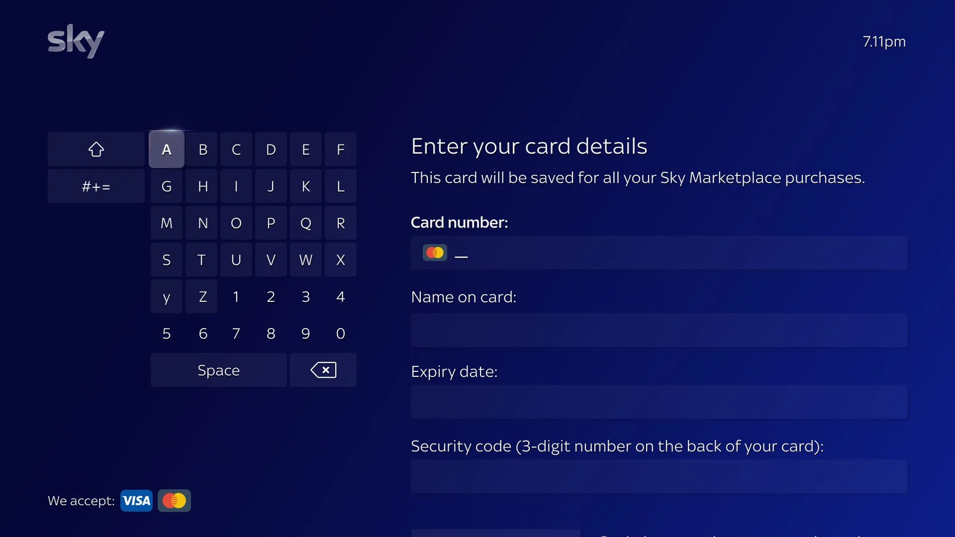
Making focus states clear and accessible whilst differentiating between what was clickable and what was in focus
Putting each form field on a line whilst staying within the safe zone, maintaining spacing and hierarchy and allowing space for error messaging
Allowing the use of special characters
Users are able to use the keyboard or remote to enter numbers but we decided not to highlight this and make it a surprise and delight event

Previous form

Solution - Input field, empty

Solution - Input field, filled

Solution - Input field, filled, in focus

Solution - Error messaging