One week. One designer. A design system built to scale.

One week. One designer. A design system built to scale.

0

Week

0

Hours

0+

Components

TL;DR

TL;DR

Solo, in just over a week, I designed and built Grove, a complete design system for an HR platform and took it from tokens to an accessible component library. AI carried the production volume so I could spend my hours on the decisions that needed brain power.


  • 1 week, about 55 hours, one person

  • ~50 accessibile components, in Figma

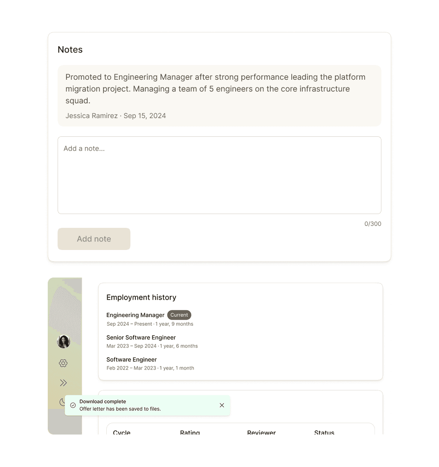
  • 18 product screens assembled from library instances in light and dark mode

  • 2 themes from 1 source, with no manual overrides

  • A motion foundation with 8 documented interactions

About TASTE LABS

About TASTE LABS

Taste Labs is tackling one of AI’s most visible problems: the flood of low-quality, generic content it produces. The company raised $18.5 million to build software that teaches AI systems the difference between quality design and “slop”, using input from 1,000 design experts and critics.

Role

Role

Design systems designer, end to end. I owned the token architecture, the component model, accessibility, the documentation and the design-to-code reconciliation. I made the decisions and set the taste. AI handled the production volume, generating token files, first-draft specs and documentation at speed under my direction.

Design systems designer, end to end. I owned the token architecture, the component model, accessibility, the documentation and the design-to-code reconciliation. I made the decisions and set the taste. AI handled the production volume, generating token files, first-draft specs and documentation at speed under my direction.

TOOLS

TOOLS

  • Figma (Variables, slots, auto-layout) for the design library, two-mode theming and composable components

  • Claude as my AI co-pilot for production throughout

example: input fields

example: input fields

Input fields are build from reusable tokens; spacing, states, icons and labels to keep interactions predictable and help designers build forms faster.

Challenge

Challenge

I ran a one-week pilot building the foundational design system: 50+ Figma components, a full token layer, iconography, theming, accessibility and golden screens engineered for 1:1 fidelity when rebuilt it in React/Storybook.

I ran a one-week pilot building the foundational design system: 50+ Figma components, a full token layer, iconography, theming, accessibility and golden screens engineered for 1:1 fidelity when rebuilt it in React/Storybook.

Goals

Goals

A multi-tier token architecture as the single source of truth (primitive, semantic, component).


  • Light and dark from one source, with no manual overrides.

  • A small set of atoms that compose into every list, card, table and form.

  • Accessibility built into every component

  • A coded library that matches the design, with every divergence recorded and addressed.

  • Documentation thorough enough for someone who did not build it.

A multi-tier token architecture as the single source of truth (primitive, semantic, component).


  • Light and dark from one source, with no manual overrides.

  • A small set of atoms that compose into every list, card, table and form.

  • Accessibility built into every component

  • A coded library that matches the design, with every divergence recorded and addressed.

  • Documentation thorough enough for someone who did not build it.

process

process

Tokens before pixels. I built the token layer first, in three tiers and bound every value as a two-mode variable. Components reference intent (action.primary), never a raw hex, so dark mode is a flip of a toggle, not a rebuild.


Compose with slots. Slots did the structural heavy lifting. One Table Cell with a content slot swaps between text, an avatar, a badge, progress or actions. One Input Shell serves text, search, number and select. One Icon wrapper swaps the glyph. Build once, reuse everywhere, which is the difference between a week and a month.


Accessibility from scratch. Every behaviour was hand-built to the WAI-ARIA practices: focus management, keyboard navigation, the combobox and menu patterns, grid navigation for the calendar, and a reduced-motion path for every interaction. Colour is never the only signal.


Motion as a system. I used Claude and Figma Make to define a small motion foundation, a handful of duration and easing tokens and documented the product's key interactions against it i.e. the button hover, the collapsible onboarding cards, the navigation and search expand and collapse and the light-to-dark theme switch.


One source of truth and an honest reconciliation. This is the part that makes Grove more than a library. The compiled component library was treated as the single source of truth for every value and the golden screens as composition reference only.


Due to the pace of the project, there was inevitably so minor Figma tech debt, such as hardcoded pixel values and mixed paddings. A delivery report was made that catalogued every place design and code diverged, grouped into what had to be created, what was fixed from a wrong token family, what the screens hardcoded and what may have been missed from the initial brief. Nothing was silently absorbed.


Documentation as a deliverable. Every component is documented against a consistent structure, with accessibility written in plain language and the slot content spelled out, then populated into the Figma library itself.

Tokens before pixels. I built the token layer first, in three tiers and bound every value as a two-mode variable. Components reference intent (action.primary), never a raw hex, so dark mode is a flip of a toggle, not a rebuild.


Compose with slots. Slots did the structural heavy lifting. One Table Cell with a content slot swaps between text, an avatar, a badge, progress or actions. One Input Shell serves text, search, number and select. One Icon wrapper swaps the glyph. Build once, reuse everywhere, which is the difference between a week and a month.


Accessibility from scratch. Every behaviour was hand-built to the WAI-ARIA practices: focus management, keyboard navigation, the combobox and menu patterns, grid navigation for the calendar, and a reduced-motion path for every interaction. Colour is never the only signal.


Motion as a system. I used Claude and Figma Make to define a small motion foundation, a handful of duration and easing tokens and documented the product's key interactions against it i.e. the button hover, the collapsible onboarding cards, the navigation and search expand and collapse and the light-to-dark theme switch.


One source of truth and an honest reconciliation. This is the part that makes Grove more than a library. The compiled component library was treated as the single source of truth for every value and the golden screens as composition reference only.


Due to the pace of the project, there was inevitably so minor Figma tech debt, such as hardcoded pixel values and mixed paddings. A delivery report was made that catalogued every place design and code diverged, grouped into what had to be created, what was fixed from a wrong token family, what the screens hardcoded and what may have been missed from the initial brief. Nothing was silently absorbed.


Documentation as a deliverable. Every component is documented against a consistent structure, with accessibility written in plain language and the slot content spelled out, then populated into the Figma library itself.

Have a project in mind?

Have a project in mind?

Open to freelance projects across UK, UAE and US time zones. Fixed-project rates and day rates available. Scoping calls are free.

Copy email

Copy email

LinkedIn

LinkedIn

Designed in Figma, built in Framer.

Copyright 2026 Jayde-Olivia. All rights reserved.